July 25, 2017

FREELANCALOT

LONG TIME, NO POST.

Having spent the first part of the year in Hanoi I've since returned to ol' blighty and am back in the UK. As always I started this year with the greatest of new years intentions on keeping up to date with my blog and social media but it seems that this year has turned out busier than I thought and I have neglected my new years resolutions.


NEVER MIND - THE YEAR  ISN'T OVER YET.

So I wanted to share just a few of the freelance design commissions I've had the pleasure of creating.


FAIR CARE 

INDEPENDENT CARE TEAM


When 4 lovely ladies came to me and told me that they were planning on starting their own independent care team, I had the pleasure of creating and designing their branding, logo, business cards, flyer and documentation.

They wanted to do things differently, for too long they felt the industry they worked in didn't not provide honest reliable person centred care, it was too corporate and did not care for the needs of the people who needed it most and the staff who delivered it.

With this in mind, the ladies I felt needed a brand name that was memorable whilst reflecting their ideals and values. After discussing ideas with my girlfriend and father, my dad suggested the name FAIR CARE.

I felt it was perfect and outlined exactly what they are offering: Fair, honest care for everyone.

With the ladies in agreement, I set about creating the logo and font. I wanted to set them apart from the usual heart in hands, bland corporate logo and they advised me they wanted something friendly and personable.

In the end we settled on the above logo with a handwritten style font, with subtle design features like the heart above the 'I' in 'FAIR' and the medical cross in the 'A' of 'care'. My girlfriends father came up with the slogan  'caring for your needs not ours' and thus FAIR CARE was born.

This design was taken forward and applied to business cards, flyers and all in house documentation and another happy client :)

POORNAUTI

ORANGE COUNTY


Back in 2016, I found myself working for the Australian medical insurance company MEDIBANK in Melbourne, Australia. 

If I'm honest the job sucked but the pay was good and most of all the people I worked with made my time there a lot brighter. Anyway I ended up meeting a gentleman who was intending on starting his own fashion brand, months later he got in touch and sent me a very, very rough drawing of an orange slice with his brand names scrawled across it.
After discussing his personal vision, I designed the above logo for his brand ' POORNAUTI' and we agreed that it met the brief and he was happy with it. He is planning on taking this design onto various stylish fashion garments and we are still in discussions and future projects in the pipeline for this brand so keep an eye out.


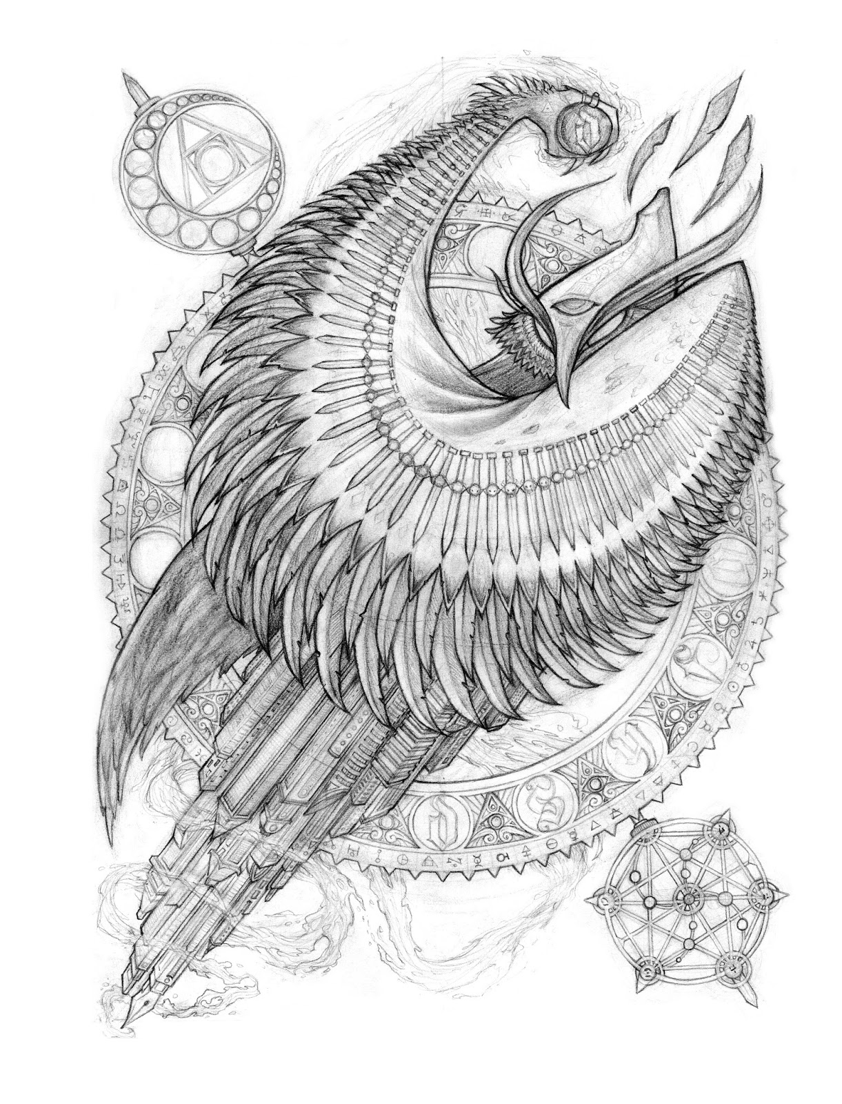
As always there is no rest for the wicked and plenty more artworks and designs ahead of me this year so stay tuned. VP


January 17, 2017

LADY INJUSTICE

LADY INJUSTICE


VISION:


A drawing I created back in 2016 to reflect how I felt about the corrupt justice system and the many injustices that humanity faces everyday. They say "justice is blind". However I think Lady Justice sees injustice but chooses to turn a blind eye to it, peeking from behind her blind fold at her many bribes. Lady Injustice does not have balanced scales but scales that are weighed down by money, greed, death and corruption. 


PROCESS:


When creating this drawing I knew that my primary subject matter would be the imagery of lady justice, which is a great starting point with plenty of cool aesthetic features like the sword and the scales. I always enjoy drawing females as well so this was a win win. Thumb-nailing out some basic compositions I found a pose I liked so went straight in to sketching up the drawing and inking it.  

With the scales initially I drew the picture with one scale full of a pile of very small notes and the other scale full of people committing atrocious crimes. At the time I thought it was a good idea but further down the line I realised I had messed up the composition and it was overkill on the detail visually. I took a step back and thought how to resolve this problem as the rest of the drawing was looking good and I didn't want this to be a waste. So I drew another set of scales featuring the skull and money and edited these into the drawing in Photoshop. 


The overall image was a good one and I was mostly happy with the result. I really liked the subtle shading and line work. In hindsight, I may have rushed into the drawing too quickly as I had that creative buzz when starting the sketch and proceeded without thinking too much about what I was doing and as result hit some problems along the way. Alas this is part of the learning process and stresses the need for solid planning in future drawings. I still hope to take this further and make it a digital painting.

January 02, 2017

OUROBOROS


THE OUROBOROS


With 2016 now concluded and the beginning of a new year I felt it is a relevant time to post a design I have been working on as it reflects the ideas of renewal and change that are associated with this time of year.


VISION:


After turning 25 earlier this year I began doing a lot of reflecting on where I am now and evaluating where I want to be in the future; not only as an individual but as an artist and designer. Questions we have all asked ourselves I’m sure. I felt that I wanted to create a design that resonated with myself and held a deeper symbolic meaning.  
It is rare that I take the time to create a design exclusively for myself and was unsure where to begin. I often start with some subject matter: an animal, an object or theme. I took a look at some of my work and noticed that throughout my drawings snakes often appear. Ironically enough around this time I was having vivid dreams that featured snakes so I used this as a starting point.


PROCESS:


My research led me to an ancient symbol called "Ouroboros".


The Ouroboros is one of oldest mythical ancient symbols of a serpent / snake / dragon eating its own tail. The Greek word 'Ouroboros' translates roughly to 'tail devouring'.

It began in Egyptian iconography and mythology; it has been used Gnosticism, Hermeticism and Alchemy as a prominent symbol. The Ouroboros is seen as a symbol of the cyclic nature of the universe: creation out of destruction, Life out of death. It shows the concept of duality. It represents the idea of something constantly re-creating itself, often associated in alchemy with the phrase 'one is all'.

Continuing my research it led me to the idea of trinity. I also began exploring eastern religions and Dharma in relation to modern science and I chose to use three snakes to symbolise the idea of matter (body), energy (mind) and vitergy (soul) and how they are interwoven and at the centre (sankhara) is the fabric of reality and the creation of life itself.

I began thumbnails and combined the various ideas until I had solid sketch laid out.


I then took this design into Adobe Illustrator and began vectoring the image. In all honesty the creation of this image was a lot of trial and error. I found it difficult to get the overlapping and the spacing of the graphics accurate creating the three equal interwoven snakes. To complete the design I altered the tails to a brush, a pencil and an ink pen as these are the creative tools I primarily work with and adding to the creative theme. At the centre I placed the VIZUAL PIRATE logo.


This design stands as a beginning and an end. It symbolises the process of change and renewal, graphically displaying the cyclical nature of the universe. It holds a profound significance for me and it quietly reminds me that we are our own universe in constant cycle. One that eliminates former practices and ideas to cultivate new ways of thinking and creating. It is with this idea of growth and renewal that I look forward to a productive, creative and brilliant year ahead for VIZUAL PIRATE.


December 31, 2016

3/3 - DSFYA OWLCHEMY


OWLCHEMY


Before the year is finally out, I thought I would share some unseen artworks I haven't shared. Here is the final design in the 3 part series of designs for DSYFA clothing. 

VISION:


To explore themes of alchemy and ancient magik combining it with themes established in the ascension project release in 2015. Tying in with the previous existing designs created in the trilogy.

PROCESS: 


I began with an idea of the old skool magician with long cloak held up before throwing it at the ground and disappearing, like in those old films and cartoons you see. Having used the panther and monkey imagery in the previous designs I decided to use the owl with the third eye in this piece. Immediately it occurred to me that the cloak could be the wings of the owl. 

I began thumb-nailing out various concepts. Trying out different compositions and poses. The design ethos of DSYFA often looked toward ancient cultures, myths, magik etc. I started researching hermetical, alchemy symbols and glyphs and knew that i wanted to bring in elements of this in my design.

Taking the thumb-nails into a finalised sketch some design elements evolved naturally, such as the blades on the cloak/wings and the solar system in the bottom right corner and alchemy symbol in the top right next to the moon. 

Finally I finally wanted to bring in some visual elements to tie it in with modern society, so I drew a skyscrapers and building where the tail should be. If you look carefully I also tried to make the building look like pens and drawing equipment as another  'hidden in plain sight' element.


Overall I was fairly pleased with the design, I was hoping to take it further and finalise it but unfortunately shortly after completing the piece I received news that the designs and DSYFA were on hold till future notice. This came as a real shock and a great shame as both myself and Steve the creative director of DSYFA had put a lot of time into the label. Who knows maybe in the future these designs will re-surface and we will see a release.


Here is the Trilogy as it is today:


December 02, 2016

LOVE BIRDZ


LOVEBIRDZ


VISION: 


For a long time I had been meaning to create a piece of artwork for her and unfortunately I had been a tad slack. However, a birthday is a good a time as ever. 

The aim was create a design that would incorporate subject matter that would be visually appealing, would be a reflection of her personality and display my love and gratitude.

PROCESS:


The weeks leading up to her birthday I had been mulling over various designs. I had ideas but couldn't pin anything concrete down, nothing seemed right. 
I had an image in my head of the overall composition being shaped like a 'C' for Cassandra (clever eh). Her surname is Fisher so I figured I would include imagery like fish, a kingfisher as I know she likes birds. I know she likes watercolour paintings so I chose to work in this medium, which was a challenge for me as I rarely paint traditionally let alone in watercolour and I had a good idea of the colour palette to use.

So I got busy and came up with this design:


At the time I was pretty stoked mainly because it hadn't been a total fucking disaster, and yes it included fish and water,and flowers and a kingfisher.


A few days later when I had a chance to work on it again. I realized that it was a total load of bollocks. It didn't reflect anything, it didn't have any significant meaning it was like I was putting random objects together and calling it art. I considered the two most important things and asked myself these questions:


1. If it was on the wall, would I like looking at it everyday? 


2. Does it communicate a clear message of how i feel about her?


The answer was a resounding NO.


So I went back to the drawing board, but I was coming up short, drawing over complicated thumbnails, trying to bring in all these visual elements to create something unique and original. Eventually with a handful of days left and with pressure and stress mounting I sat down and asked her about what she would want in an image.


Cass didn't have all the answers but she did have this nugget of wisdom 
 " it doesn't have to be complicated, just something simple."

I had been forgetting that golden rule : KEEP IT SIMPLE STUPID. 


So the next day I sat down and i thought about aesthetics that would be simple and communicate message of love. 


The Imagery of two lovebirds together sat on a moon like C shape was perfect.

I knew that first time round i hadn't made use of the watercolours so I focused on that.

I spent the next few days painting and completing the image. I then took it to the framers with just enough time to get it framed and ready for the birthday. I put the picture in a plastic bag and walked proudly to the framers but when I pulled it out of the bag at the framers, it had soy sauce all over it..... the bag had some in the bottom. 

I WAS FUCKING FURIOUS! I could not believe it. I rushed home and tried to save it with white paint. I managed to repair it as best i could and took it back to the framers.

The framers did an amazing job and here it is in our flat:


I learned that sometimes the wrong path can lead you to the right path. Taking a step back to re-evaluate can give you the answer you need. That sometimes simple is better and even if it isn't the most original design the masked over soy stains will forever make it one of a kind.

HAPPY BIRTHDAY CASS <3

October 07, 2016

WIP - DSYFA 2/3 SPACE PANTHER


THE SPACE PANTHER


Following on from 'OZOLOMATI' Here is a work in progress drawing from the 2nd of 3 designs I have been producing for DSYFA clothing.

VISION: 

Yes on the surface it does appear to be a pregnant, half panther, half woman which is weird but I wanted to symbolize the idea of creation in life and in space and the inherent similarities we all share within our atoms and DNA but in the form of a hybrid deity.

The tail forms the shape of the Fibonacci spiral / infinity symbol which transforms into a  double helix of DNA and the legs eroding into molecular atomic structures. I haven't yet added the detailing or colouring to the skin. I want to add to stars and galaxies all over the skin to add to the idea that we are all born from the stars and the 'birth' of the universe hence the pregnant thing.

You should of seen the looks my girlfriend gave me when looking at my google search history, containing the words ' naked - pregnant - woman - pose'

Anyway there is still some work to go with this design but ill keep updating as it evolves.

And in case your actually reading this , add my Instagram: @vizualpirate

June 29, 2016

LIVE BY THE SPADE . DIE BY THE SPADE

LIVE BY THE SPADE . DIE BY THE SPADE


So I spent 3 months working on a banana farm in a small town of Tully, North QLD, Australia. Famous for a giant gumboot and the most rainfall in Australia which the height of the boot represents and not a lot else. Living on a colorful caravan park (someone actually shat on the BBQ) in a decrepit box of a caravan with my beautiful girlfriend.  

I worked as a 'Spader', essentially working in teams of 3 you go up and down endless rows of banana trees, acre after acre, using a spade to hack off the little banana trees called 'suckers' that grow off the mother tree. These pesky suckers suck up water away from the mother tree and this means that they wont produce as much fruit.

I wont lie its was fucking hard work and my hands after the first day looked like I had run them through a belt sander but it was incredibly fun and overall an amazing experience. I met amazing people, I saw amazing things and I drunk a lot of goon.

This inspired me  to create this piece of artwork as a tribute to my time on the spade. Everything included in the illustration  are things we came across daily on the paddock - snakes, lizards, toads, spiders, march flies, preying mantis', ibis, maggots .. basically it was small jungle out there. Then there are the ducks which were pets of my good friend Dean who lived in a tent for 3 months with his ducks that he raised from ducklings. He now is the proud owner of the original artwork.

This illustration took me some time to complete but it was a true labor of love for my time in Tully and all of my fellow Spaders. 

Below are the initial roughs sketches :


 And here are a few photos from the paddocks: